
A Historic Mid-Century Modern Home That Was Completely Brought Back To Life (Hope You’re Ready For Some COOL Original Details)
Sarah Zachary-Jones has easily become one of my favorite designers. Remember this home and this home?? They are exciting, inviting, and full of custom details (a gal after my own heart) that let you know you are in a home that was uniquely handcrafted for that person or family. They are all different but just have that special touch that makes it clear they are hers. So when I saw this new project start popping up on her Instagram, being the true fangirl that I am, I asked her if we could feature it. As you likely can conclude, she said yes. What’s extra cool about this space is the history behind it. It’s clear from the photos that this house had historic elements so I needed to know the story. This is what Sarah said:
“The house was built in 1951 and designed by Chinese-American architect Gilbert Leong. He studied at USC, worked under Paul Williams before starting his own firm, and designed several buildings in LA’s Chinatown. It is located near the Silver Lake reservoir. The house has some cool original details including the wood and amber glass room divider in the dining room and tv room wallpaper. Also some not-so-cool ones, like ugly giant recessed lights that we removed. The style is mid-century modern with Chinese decorative motifs throughout.”
Well, you are about to see those cool original details? Buckle up!
")
Wallpaper | Rug | Pendant | Mirror
We are clearly wallpaper lovers over here so this entrance was a big 10/10 in our book. But I know that while a lot of people love design, a big wallpaper moment can still be a scary risk. I asked Sarah what were the things the clients ask for, what did they not want, and what was on their wishlist, and here’s how it went down:
“My clients gave me the greatest gift a designer could ever receive. They literally told me “Just do you!” A dream come true. I figured that they liked color and weren’t afraid to go bold at our initial meeting because I spotted neon Yeezy slides in the entry and one of the clients was wearing orange and yellow tie-dye sweatpants. I sent them some inspiration images with bright colors, tons of patterns, and modern furniture and they let me go for it.“
Emily always says to look in your closet for decor inspo because likely what you put on your body is the same vibe you will like in your home. So what a smart way to figure out if or how much color a client is going to probably like!


Both Ryann and I loved that she took advantage of that ledge and leaned some very cool art that totally speaks to the western motifs of the wallpaper. Also, I always like to ask where designers get their art because I LOVE ART and want everyone’s secrets (and then share them with you all). This is what Sarah said:
“Most of the art in the home is from Lawson-Fenning. A mixture of vintage artists such as a Josef Albers and contemporary artists like Anna Ullman and Todd Magill. The framed pieces in the entry are blueprints and illustrated landscape elevations from the house.“

Bench (custom) | Round Pillow (similar) | Green Pillow (similar) | Tray | Hand Sanitizer | Candle
Ugh, how cool are those blueprints?! Especially since it’s such a special home that’s kept so much of its history.
But let’s now look down to the concrete floors. I wanted to know if they were original or if she chose to install them. When I asked she said that they were concrete when she came on the project but in the Redfin photos they were oak floors. So it’s a mystery as to why they were replaced. I’m sure they were in pretty bad shape since the owners seemed to care deeply about maintaining the history. But honestly, I really love how they turned out. I think it balances out all the beautiful warm-toned woods and adds to the modernism of the home’s architecture.
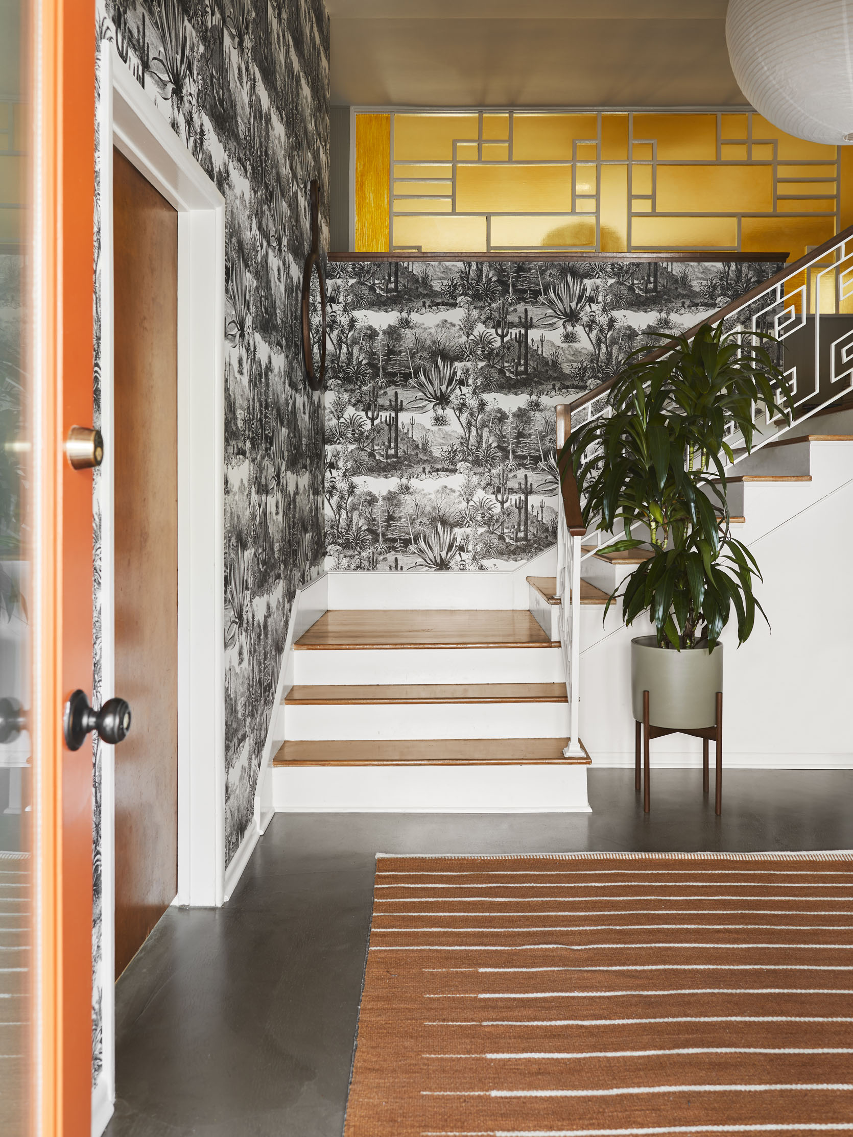

That screen!! It’s just so cool. I couldn’t imagine the clients or Sarah wanting to remove it but I’m just so happy that it stayed. And not just the screen, but look at that railing. Those two features let you know right away that this isn’t your average home.
I think the rice paper lantern was a perfect choice, giving that textured natural and light feel. The screen and railing work with the lines of the rug, the wallpaper talks beautifully to the plants the simple lines of the bench, the accessories and planter add that modern touch, and the elevations give that fun blue pop of color that’s perfectly unexpected. Plus the oranges, rusts, and olive greens work perfectly with the gold film of the screen, making it not shout at you when you first walk in the door. You have a chance to slowly take it all in… which I love.
Ready for the next space??

Sofa (custom) | Mustard Square Pillow (similar) | Rust Square Pillow (similar) | Yellow Print Pillow | Table Lamp (similar) | Floor Pillow (custom) | Coffee Table | Striped Box (similar) | Art
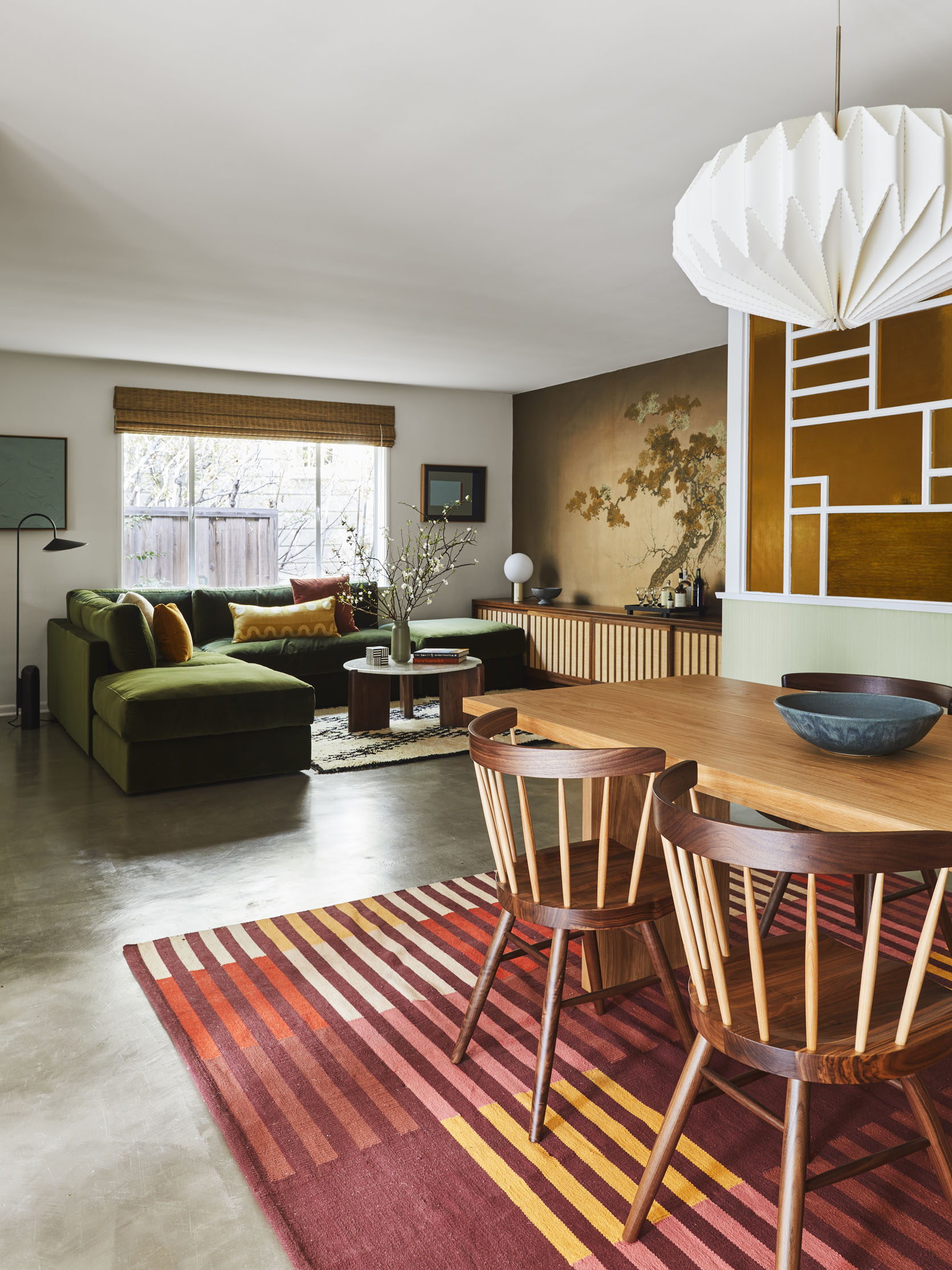
Ooooo baby I have to say this might be my favorite room. That sofa is TO DIE FOR. Plus there are a couple of fun surprises I think you will also freak out over in the next couple of pictures. But first, I want to talk about the color palette and how Sarah came up with it. Did the era of the home dictate the palette? Was it the clients? Here’s what she said:
“Not so much the color palette, but definitely the style of furniture. My client actually showed me a postcard (he collects postcards) with a color palette he liked which was a picture of poppy fields with tones of orange, purple, and green. We did a lot of green and hints of burnt orange, but decided to ditch the purple.“
The postcard thing is something you should get excited about. But let’s see more of this room first.

Art (on left)
Simple, cozy, inviting, and has the “Sarah Zachary-Jones Expert Color” touch. The sofa is custom and looks like you just want to sink your whole body into it. Then for the art, rug, floor pillow, etc., she keeps it simple enough that your eyes are at ease but patterned and textured enough to keep the space interesting and fun to be in. Also big shout out to those woven shades. I love the warmth they bring into this home. If you are thinking about a woven shade I say do it!
If you want to see more of what’s on your left, you are in for a TREAT.
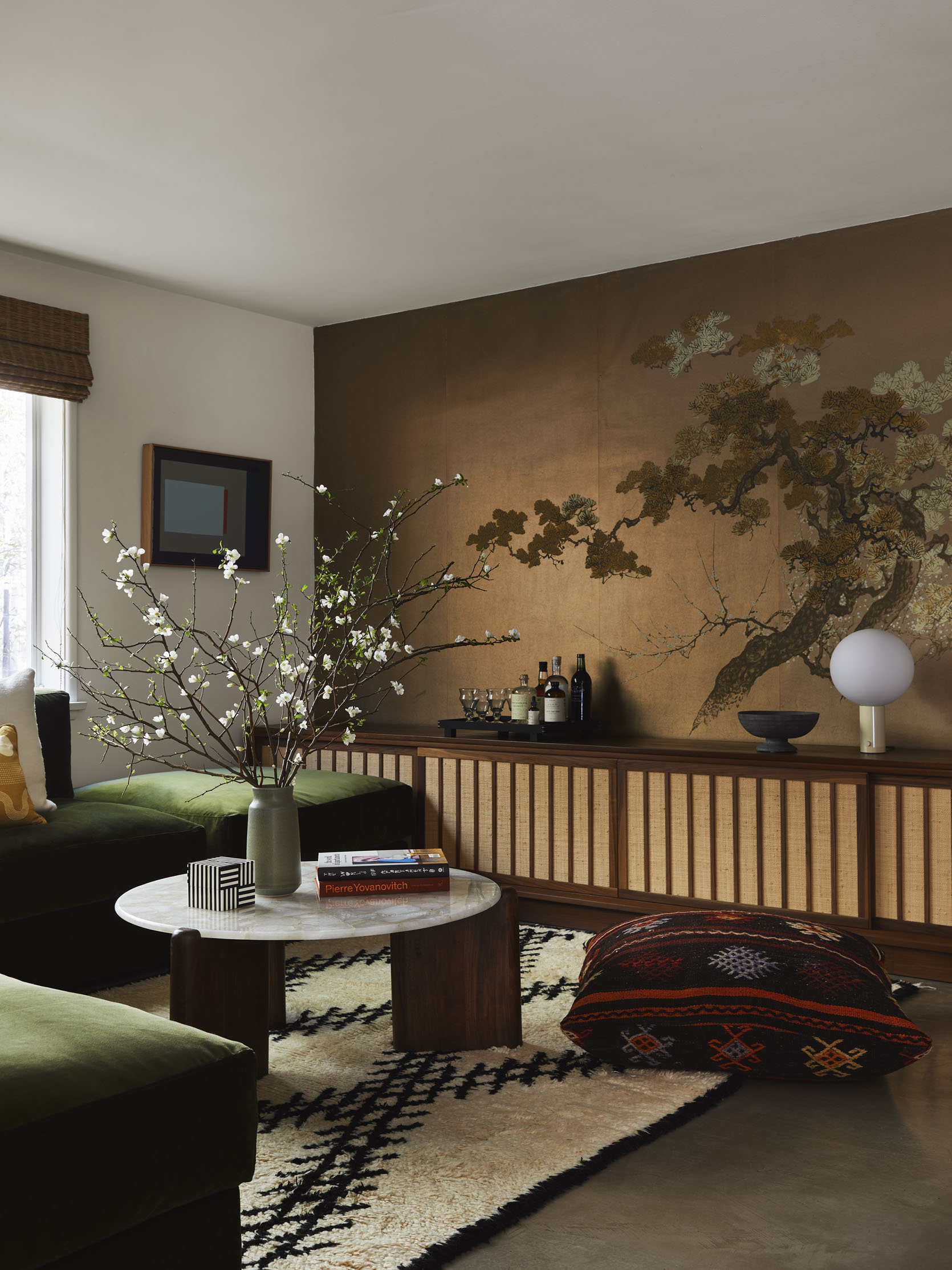
Black Tray | Table Lamp | Mural (original to home)
This shot makes my heart stop a little. That custom credenza, that MURAL (which is ORIGINAL), the styling that Bowser did… it’s all perfect. But let me have Sarah tell you all about it:
“This is my favorite piece in the house. I wanted to include some furniture and decor that called to the Asian heritage of the original architect. This cabinet is inspired by the designs of George Nakashima (although he was Japanese American). The cabinet is a custom design for the space made out of walnut and grasscloth. The piece is a whopping 11 feet! It is meant to store the large book collection of the clients. The mural was original to the house or at least installed quickly after completion. The clients still have extra rolls of wallpaper in the original packaging. Here is a photo (see below). It appears to be made by James Seeman and I think it is handpainted. We did minor repairs to the paper where speakers were previously installed and built the cabinet to land right at the base of the tree trunk.“

Is it not all just breathtaking? And how cool are these hanging instructions? I love this stuff so much.
See how the lines of the cabinet talk to the lines of the dining room rug?? It’s details like that which will make an open concept floorplan look interesting and unique but still look like that spaces belong in the same home.
But let’s now talk about design challenges because I don’t think there’s ever been a home design project that’s been completed without one. These were Sarah’s:
“We did have to turn a dining room into a sitting room/future screening room. The layout was tough because it butted up to the kitchen and dining room. We decided on a modular sofa with ottomans so it doesn’t feel too overwhelming in the space. We also replaced a lot of the old recessed lighting with pendants and fixtures and had to do quite a bit of electrical and patching work.“
It’s wild to think this wasn’t always the layout because it makes so much sense.

Dining Table | Dining Chairs | Rug | Pendant
Did you gasp when you first saw this shot? It’s so happy I can’t stand it. The color palette makes my heart sing. I grew up in a warm-toned house so maybe I’m partial but regardless it’s so pretty. Now, my first question to Sarah was about that wall treatment. I couldn’t tell if it was wallpaper or special paneling or something else so here’s the 4-1-1:)
“This was here when the clients moved in and from what I can tell it is a brushed plaster treatment that has a ribbed effect. We painted the walls in Ash Grey by Farrow and Ball.“
Also those mustard-colored drapes!!!!

Postcards (vintage) | Postcard Rack (vintage)
Here are the postcards! Collections are such a great way to show off your personality. But the fact that they displayed it how you would buy a postcard usually in a store is truly such a perfect and out-of-the-box way. So while her client already had the holder, Sarah decided to put it in the dining area so that they could be enjoyed more readily. It’s just the coolest and now I want to collect postcards.

What a glorious angle of that screen. That pendant (which Julie also used in her bedroom reveal) calls to the pendant in the entry but has a geometric shape that calls to all of the lines in the dining and sitting room.
Also, I love how Sarah played with a few different wood tones BUT they all have a warm undertone so that’s why it works so effortlessly.

Here you can get a better look at that plaster treatment. I don’t think it’s for every style of home but I love it in this one.
Now let’s enter into the final room that Sarah designed. And as you can see it’s a pretty special one.

Wallpaper | Sofa | Coffee Table
These jewel-toned colors, that sofa (the same one Emily had in her LA house), the blue planter, the coffee table, the everything… At first, I thought this was just the coolest office ever (see next picture) and wanted to know the details of the decision to not wallpaper the ceiling and drop ceiling…
“This is actually a living room with a desk that we haven’t fully shot because a few large art pieces hadn’t arrived. So it’s a really big room with a ton of wallpaper and I didn’t want it to feel overwhelming or for there to be too much reflection of the green from the wallpaper.”

Desk | Desk Chair | Lamp | Art
I also noticed in both rooms that there were recessed drapery tracks for the mustard drapes. SO beautiful and chic. I clearly needed to know more…
“I had never done this before so I’m glad I have this one under my belt now. I had my handyman cut out the drywall and install the tracks flush with the ceiling and then patch and paint the entire ceiling. Then the window treatment fabricator installed the drapery. Some companies will do the entire process, but our window treatment installers do not.”
I think it’s such a nice detail because of how seamless it looks. Especially perfect for modern or mid-century modern style homes.

Shelving Unit (custom)
If you know anything about Sarah she is a custom-furniture-loving gal (which again, speaks to my soul). So I asked her to walk me through all of the custom pieces to make sure we got them all:
“The sitting room cabinet, the entry cabinet, the green sectional, vintage kilim floor pillows, built-in walnut shelf in the living room, blue Moreno Sofa from Lawson-Fenning in Holland, and Sherry performance velvet and drapery.“
Well, my friends, this tour has sadly come to an end. I feel so inspired and I hope you do too. Thank you Sarah for letting us feature this wonderful project! Ok now let’s chat about out favorite parts in the comments:)
Love you, mean it.
*Design by Sarah Zachary
**Styling by Emily Bowser
***Photos by Sara Ligorria-Tramp


